UI/UX // WEB // PRINT // ILLUSTRATION // CASE STUDY
Lucy is a hypothetical upcoming video game with anime inspired visuals. Its monochromatic and sophisticated color palette with thin typefaces gives a light and fleeting feeling, corresponding to the theme and main character of the game. The game is supported by a set of 3 promotional posters to garner attention and interest, as well as a website showcasing general game information.
OPPORTUNITY
This hypothetical game is in need of a user interface design that accommodates to the predetermined art direction. It also needs a website that can effectively layout the necessary information about the game. In collaboration with an artist, cohesive and dynamic promotional posters are also needed to garner interest from the audience.
TARGET AUDIENCE
The primary target audience that Lucy is aiming for is late teens to late twenties, as they are the ones still often actively enjoying video games. They are captivated by story driven games that have interesting characters and engaging gameplay with sleek visuals.
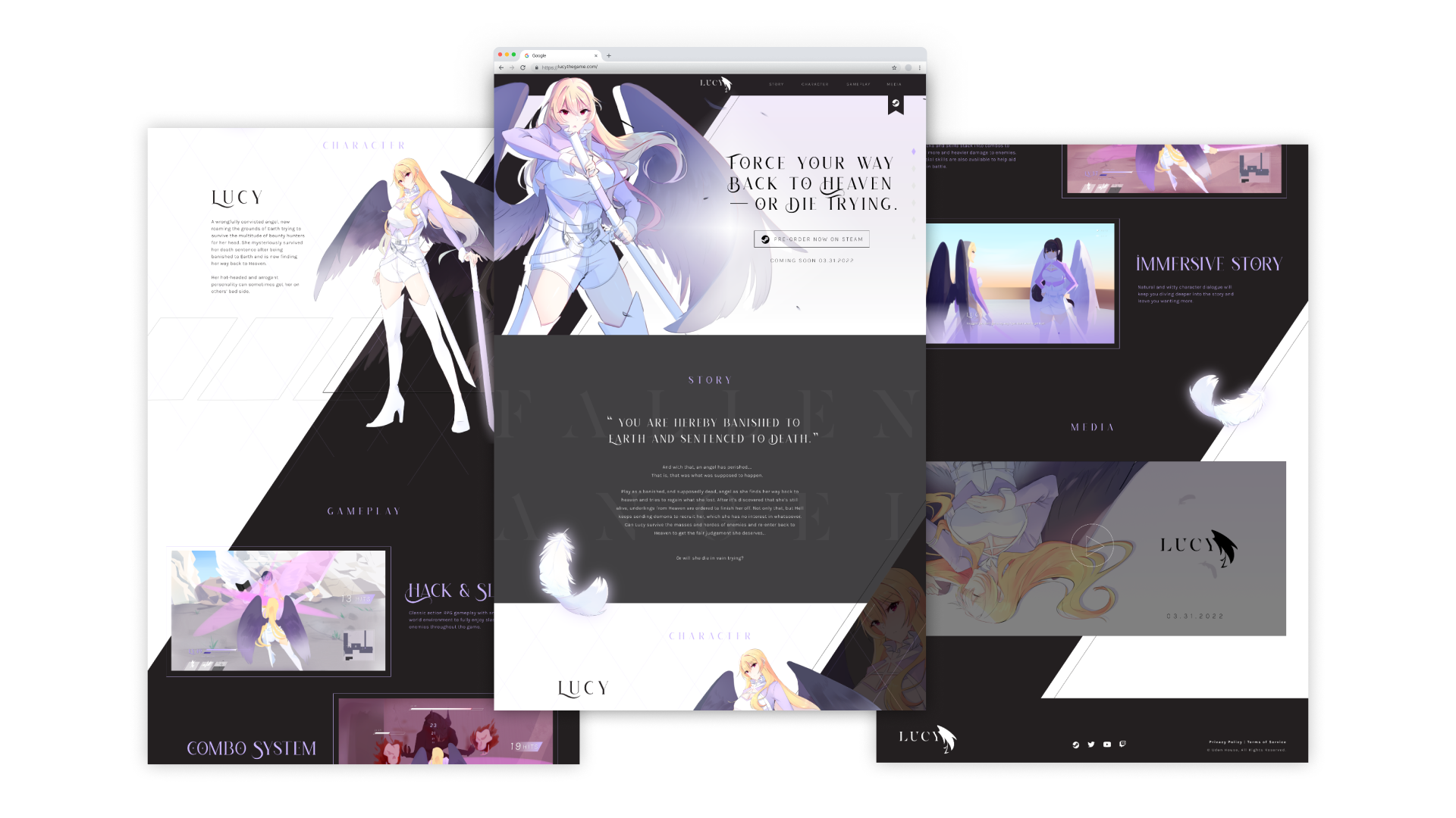
WEBSITE
GAME UI/UX
POSTERS
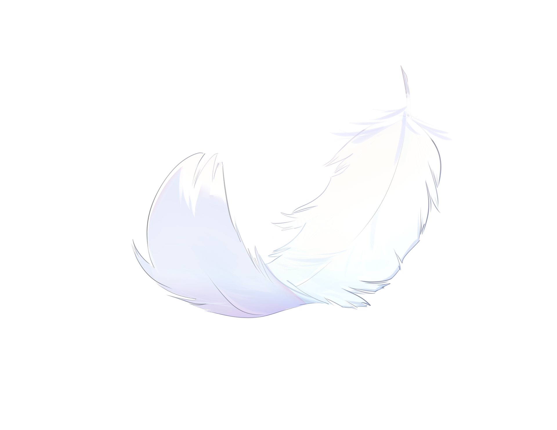
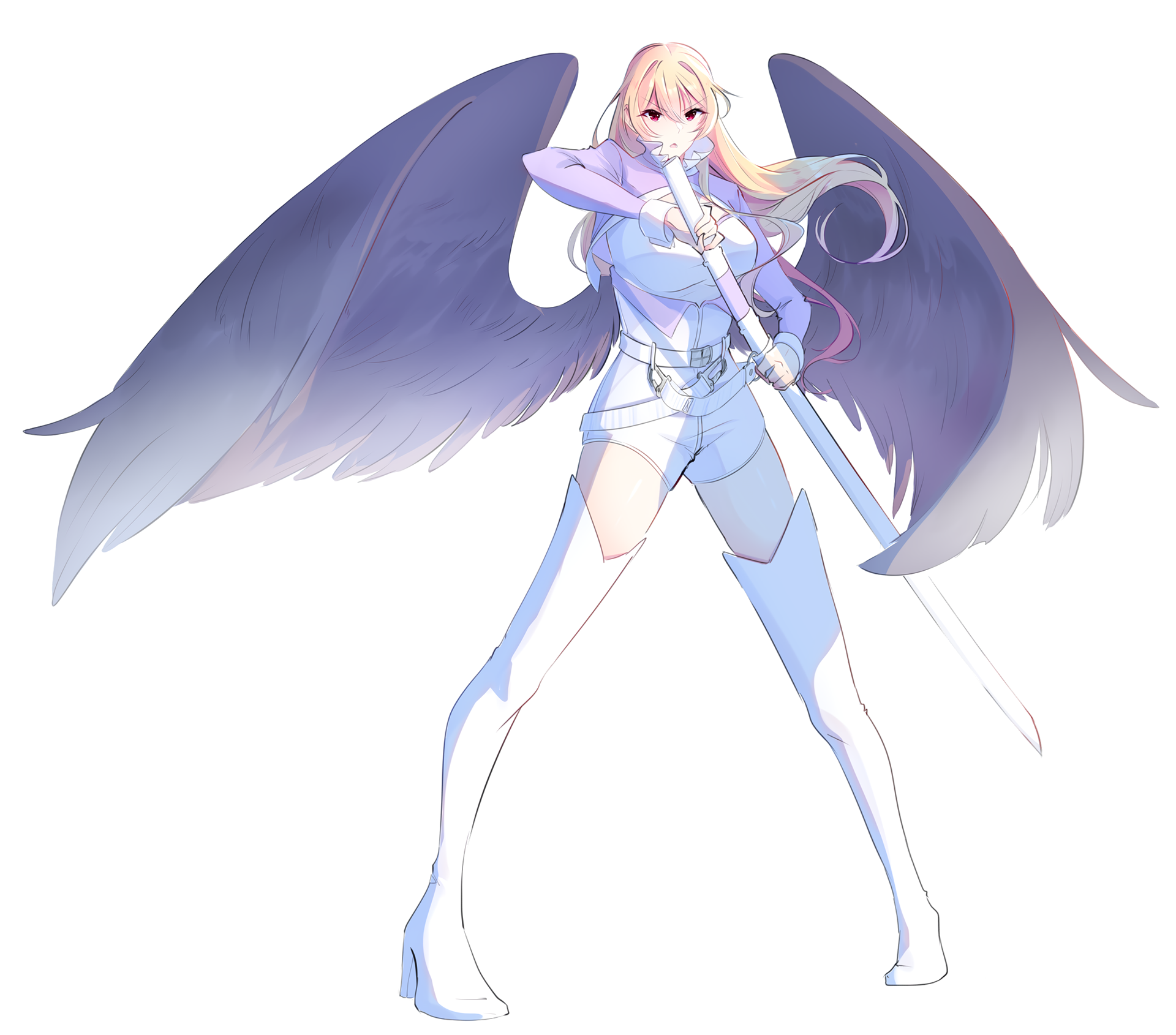
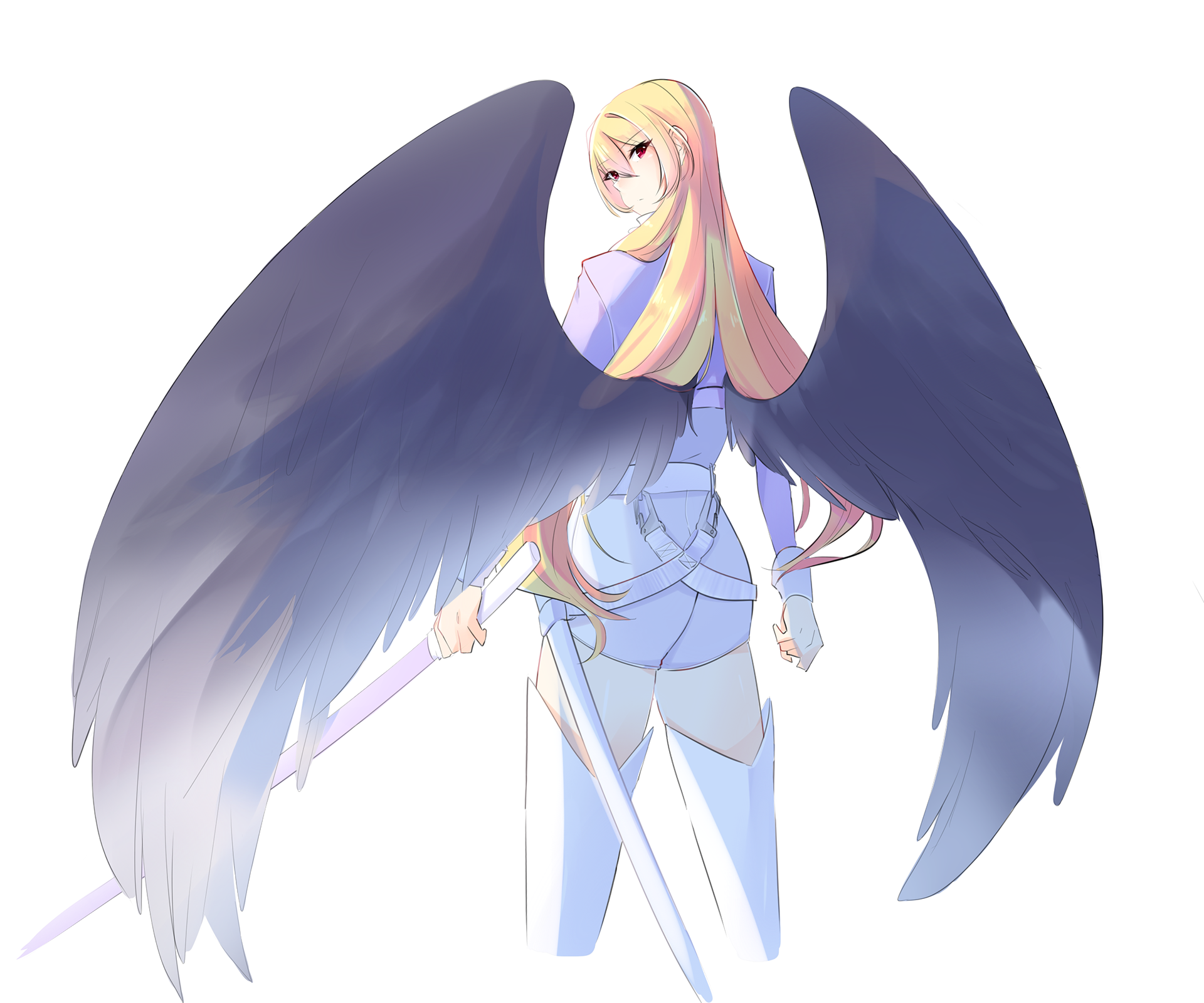
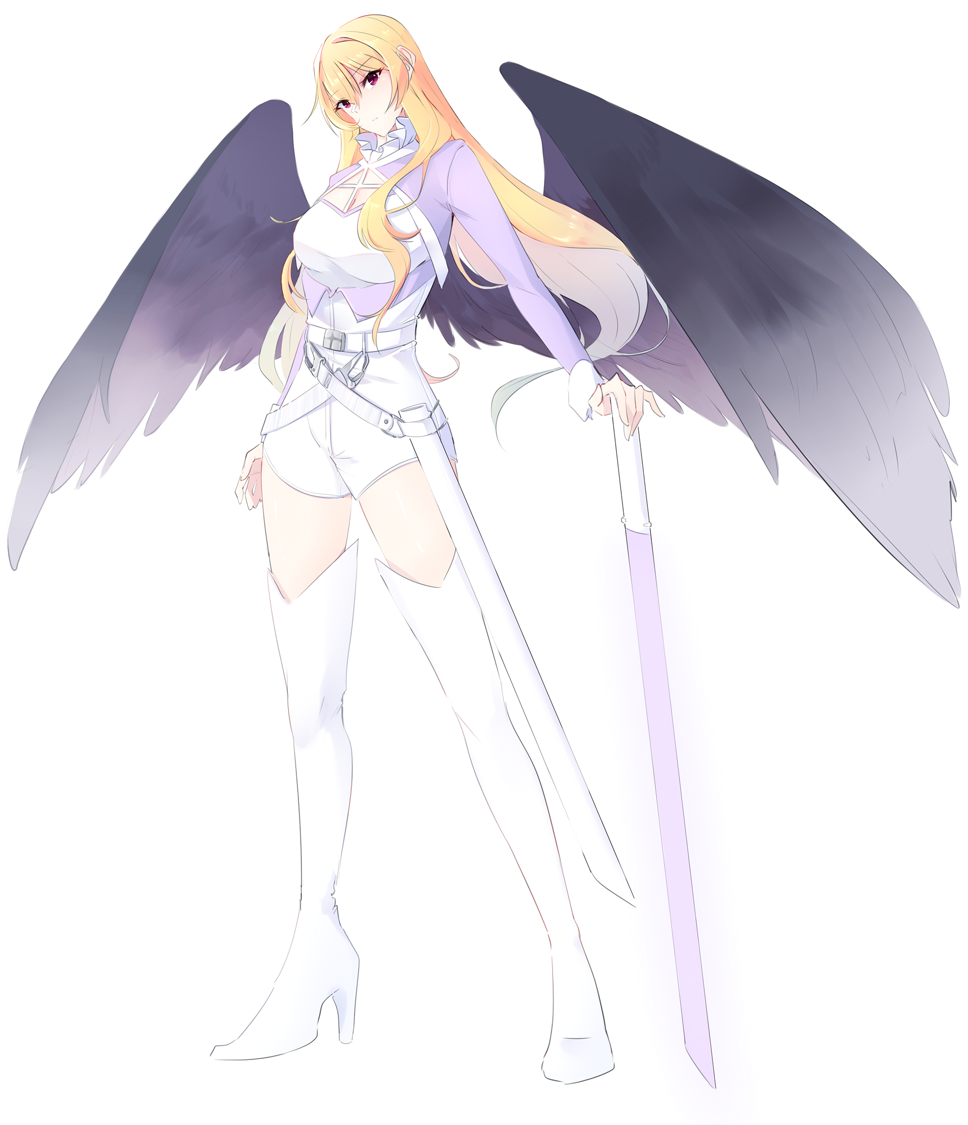
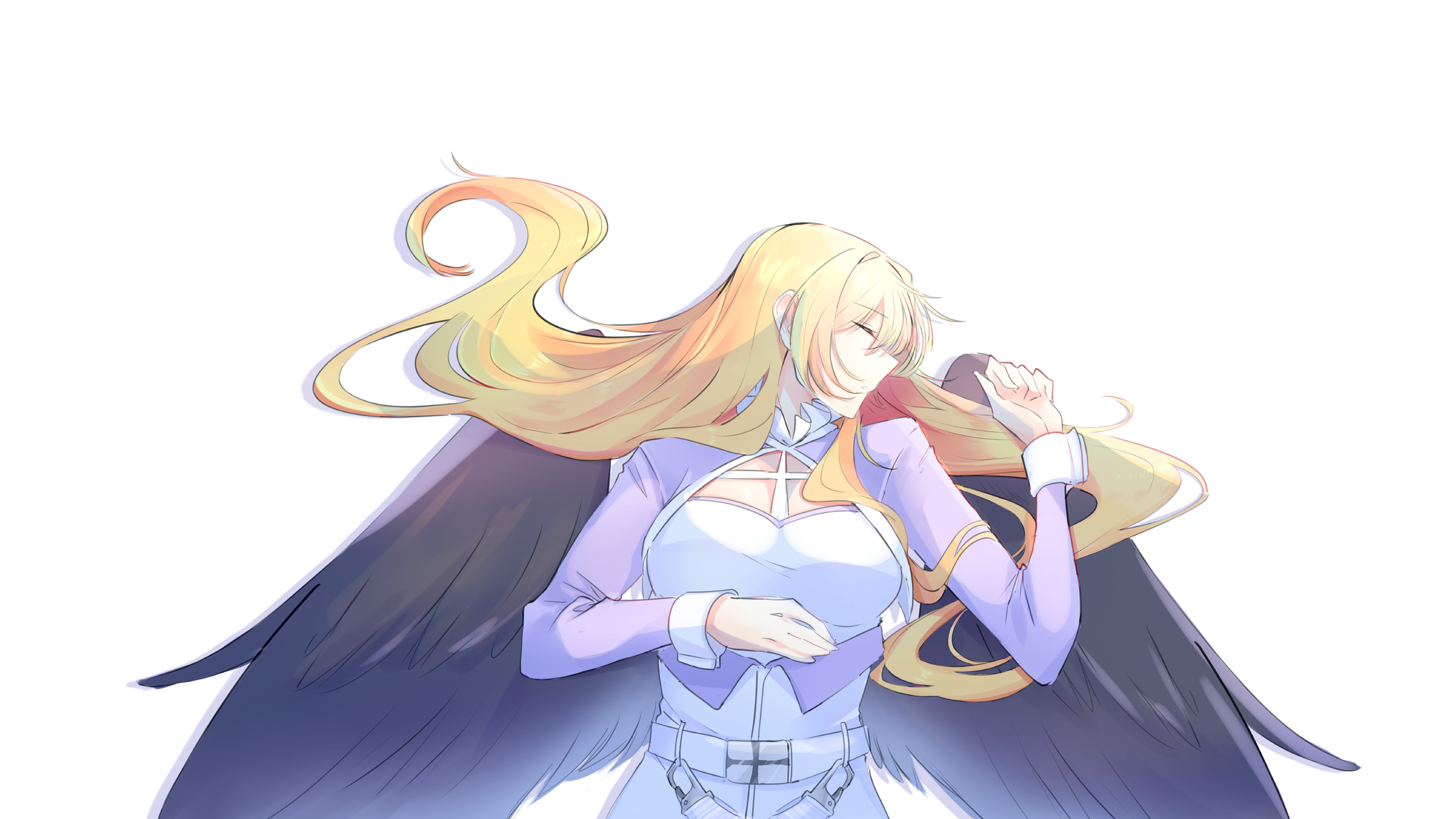
ILLUSTRATIONS
RESEARCH
Upon researching existing games that are of the same genre that Lucy is going to be apart of, I found that a lot of the design elements are quite simple. UI elements are kept simple and no-frills as to not distract players. Promotional posters are usually either a character with some text, or multiple characters in a beautiful landscape. A majority of these game websites are one page scrolling sites with very minimal subpages. An important note was that all designs, and marketing materials all had a cohesive aesthetic throughout.
DESIGN SOLUTION
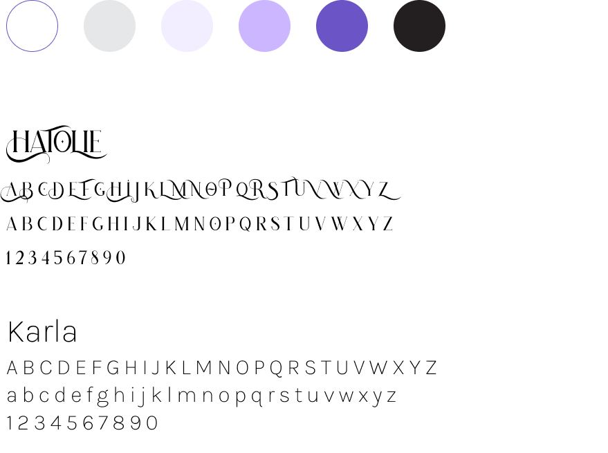
For the design solution, it was important that all deliverables were cohesive with each other. I went with a monochromatic color scheme sampled from the main character’s color palette. This allows any secondary elements alongside illustrations to match without clashing or steal attention. The feminine color corresponds to the game’s character and feel, but the overall modern and sharp elements keeps the game inclusive and palatable in general.
As for the typefaces, I chose a decorative display serif that gives a fleeting and elegant feeling. Paired with the display serif is a sans-serif that’s unobtrusive and legible for the user.
As for the typefaces, I chose a decorative display serif that gives a fleeting and elegant feeling. Paired with the display serif is a sans-serif that’s unobtrusive and legible for the user.

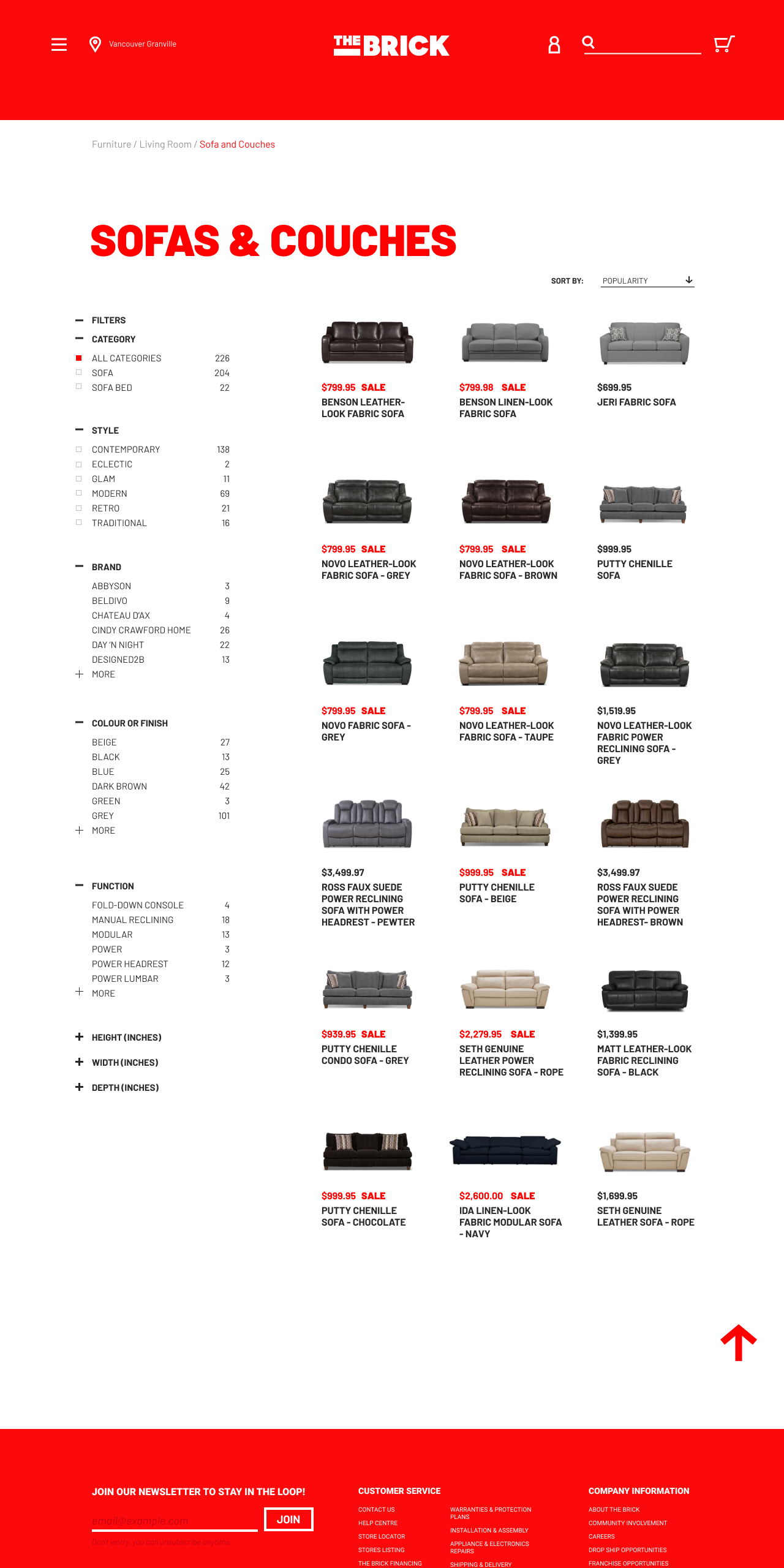
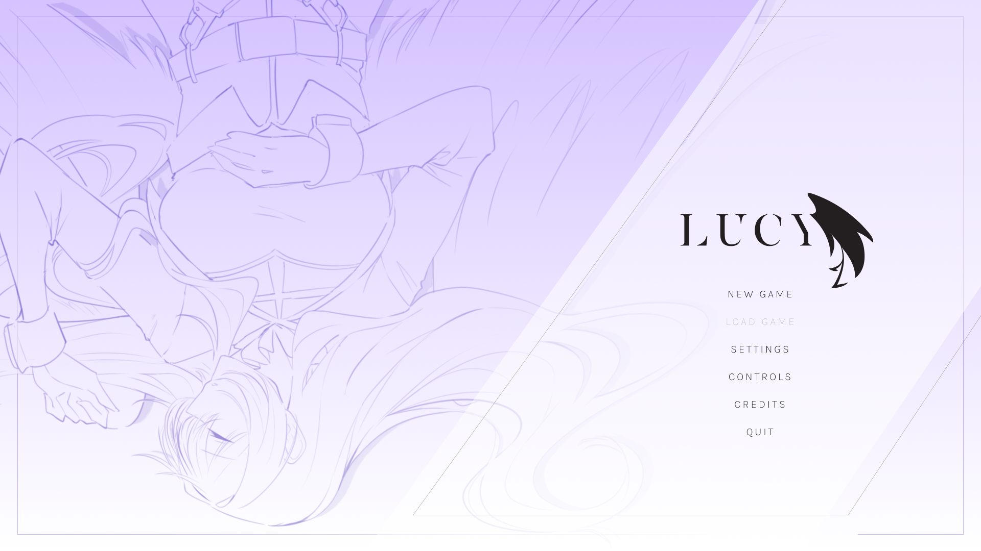
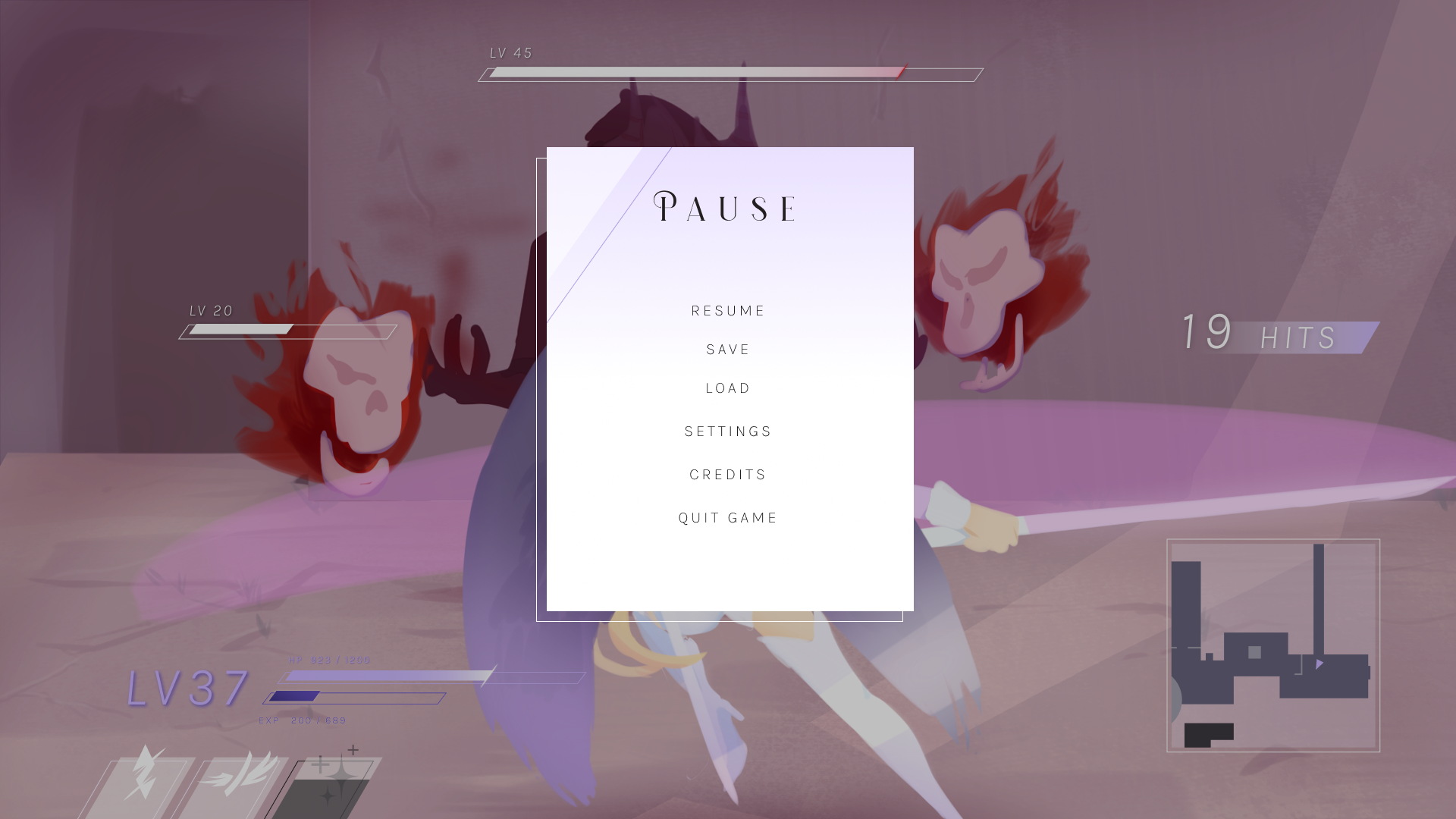
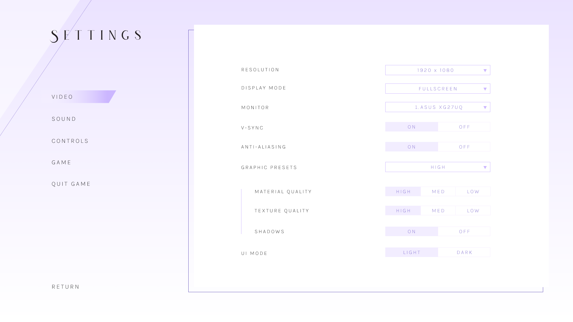
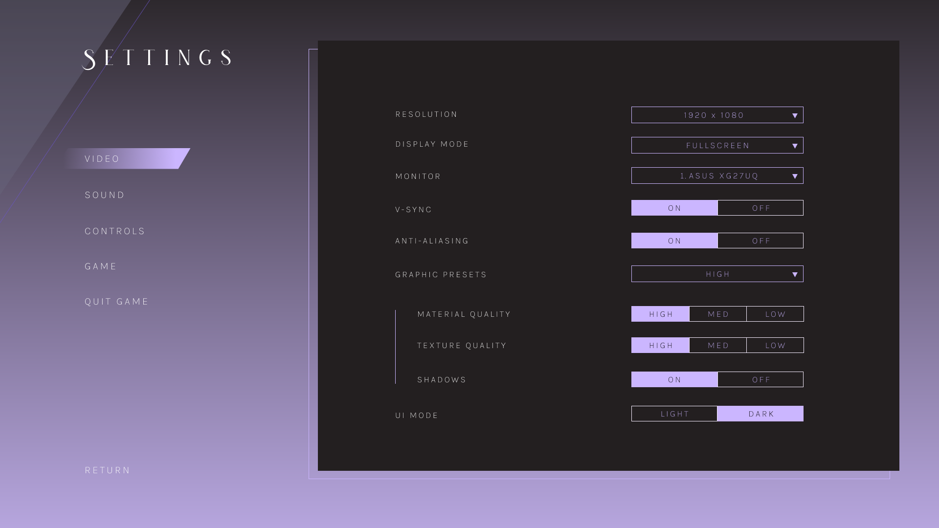
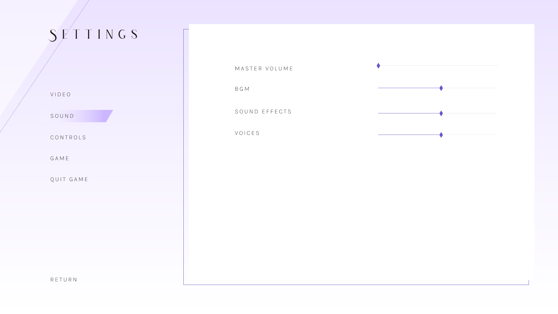
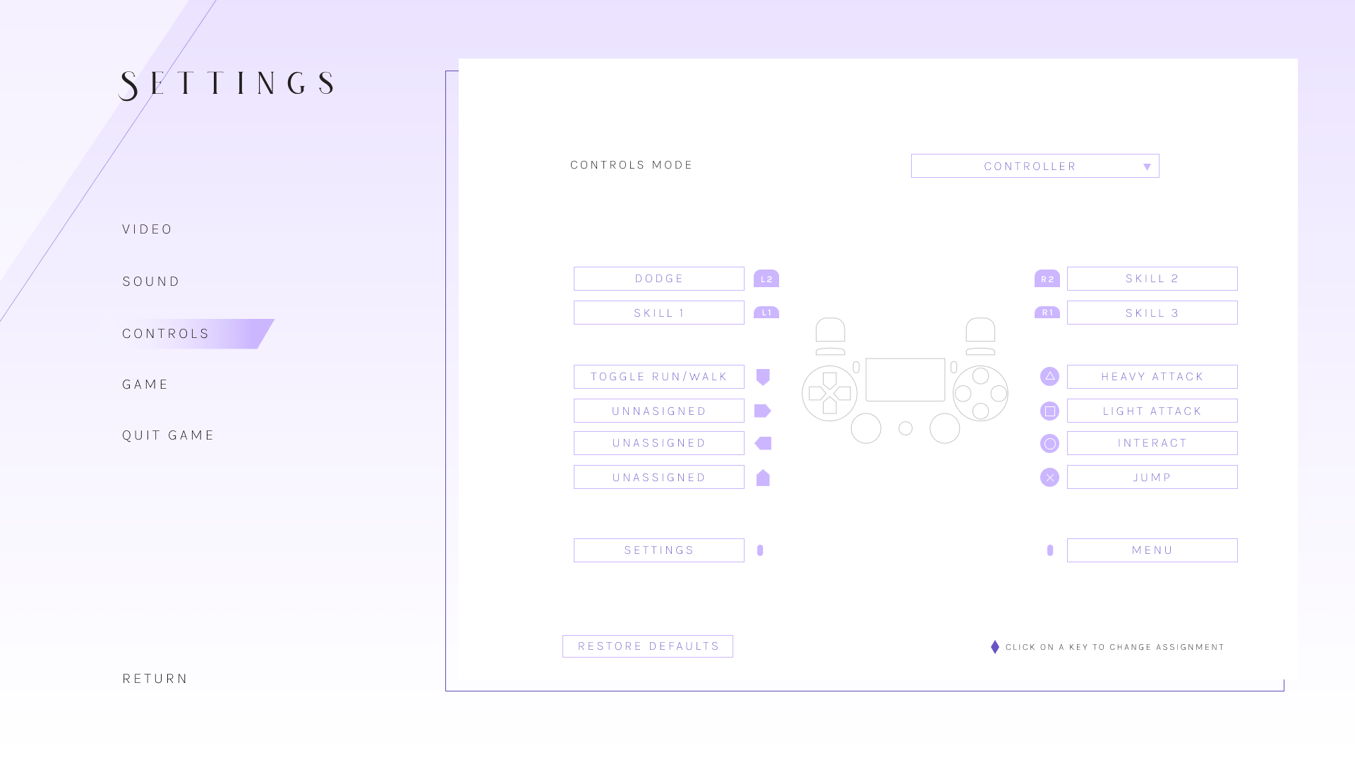
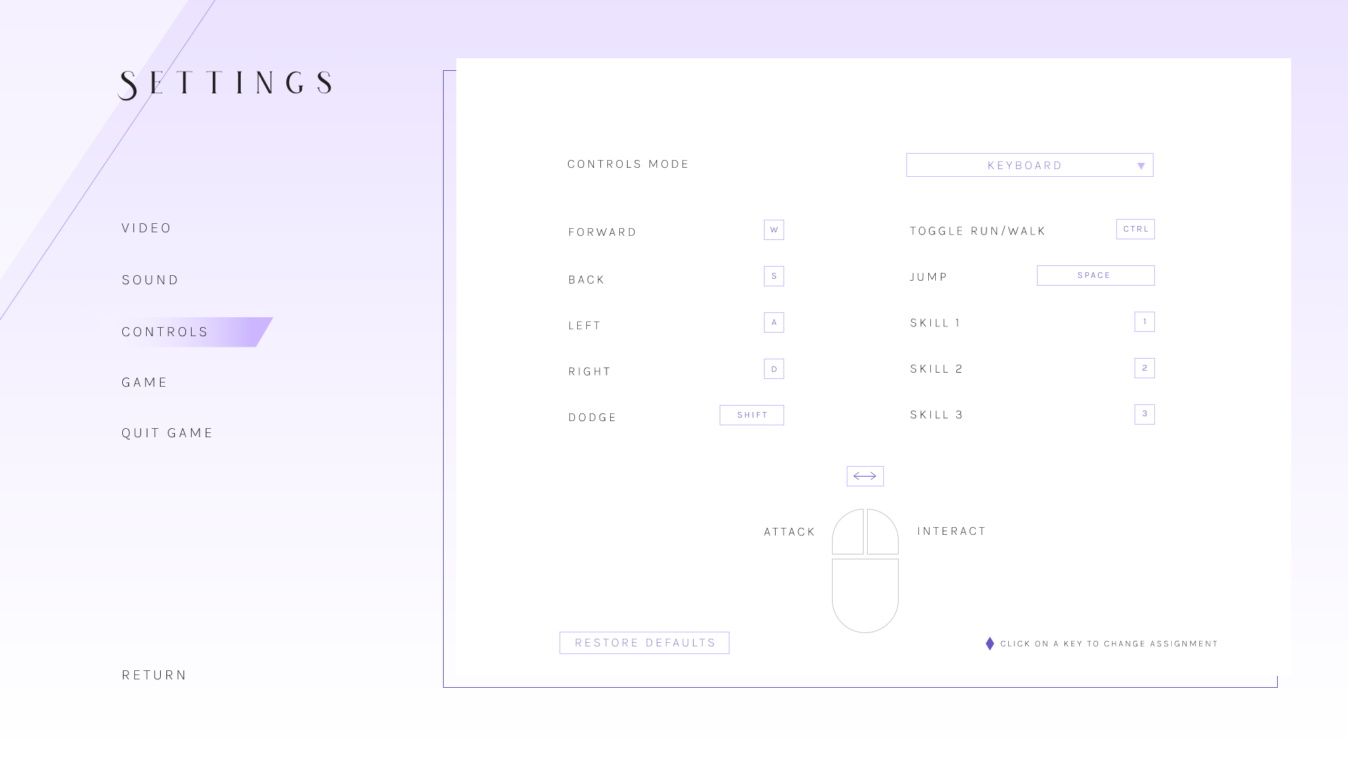
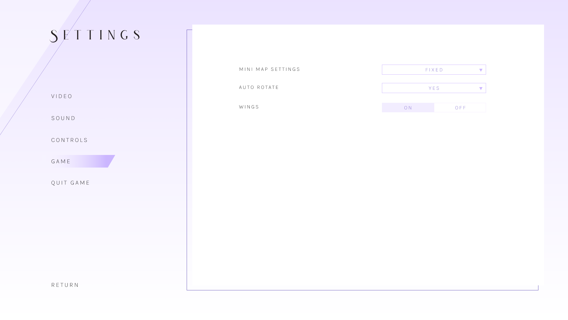
UI/UX
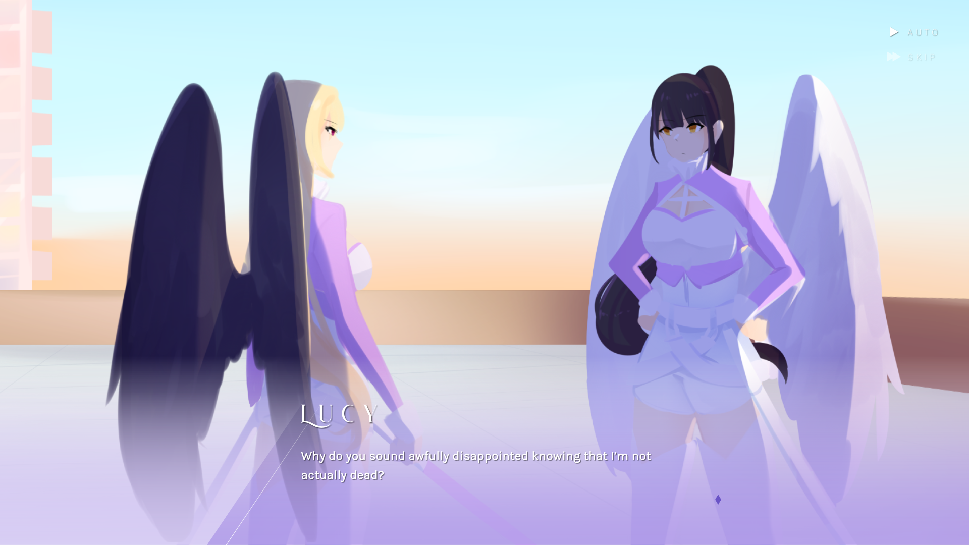
The UI, as mentioned earlier, has a monochromatic palette that represents the character’s colors. The UI is kept simple and uncluttered with a reasonable amount of negative space so that users can easily scan for the information they need. The items in the settings menu are spaced out so that it’s easy on the user’s eyes. In addition, a dark mode is available for the user if they so wish to use. Dialogue scenes are accompanied by a light purple gradient for the textbox so that it does not distract from the text.
* Press ESC in prototype during gameplay screen to access Pause Menu
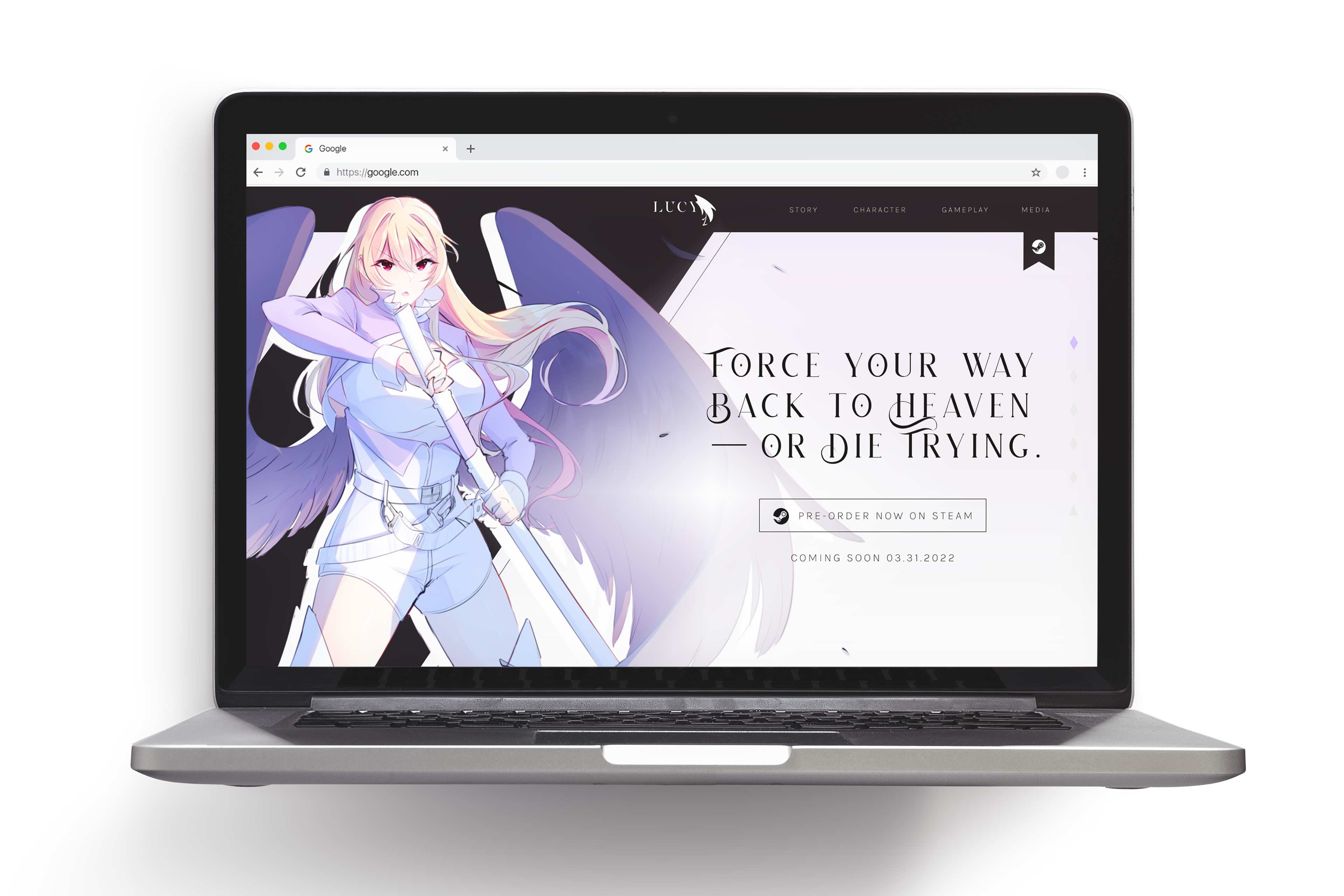
WEBSITE
For the website, I went with a one page scrolling website so that every information needed is laid out at once without the need to navigate to multiple pages. A sidebar navigation is made available so that users can quickly jump to the different sections or back to the top page if necessary. Each section is laid out differently to keep each chunk visually interesting and distinct all the while sporting the same visual language.
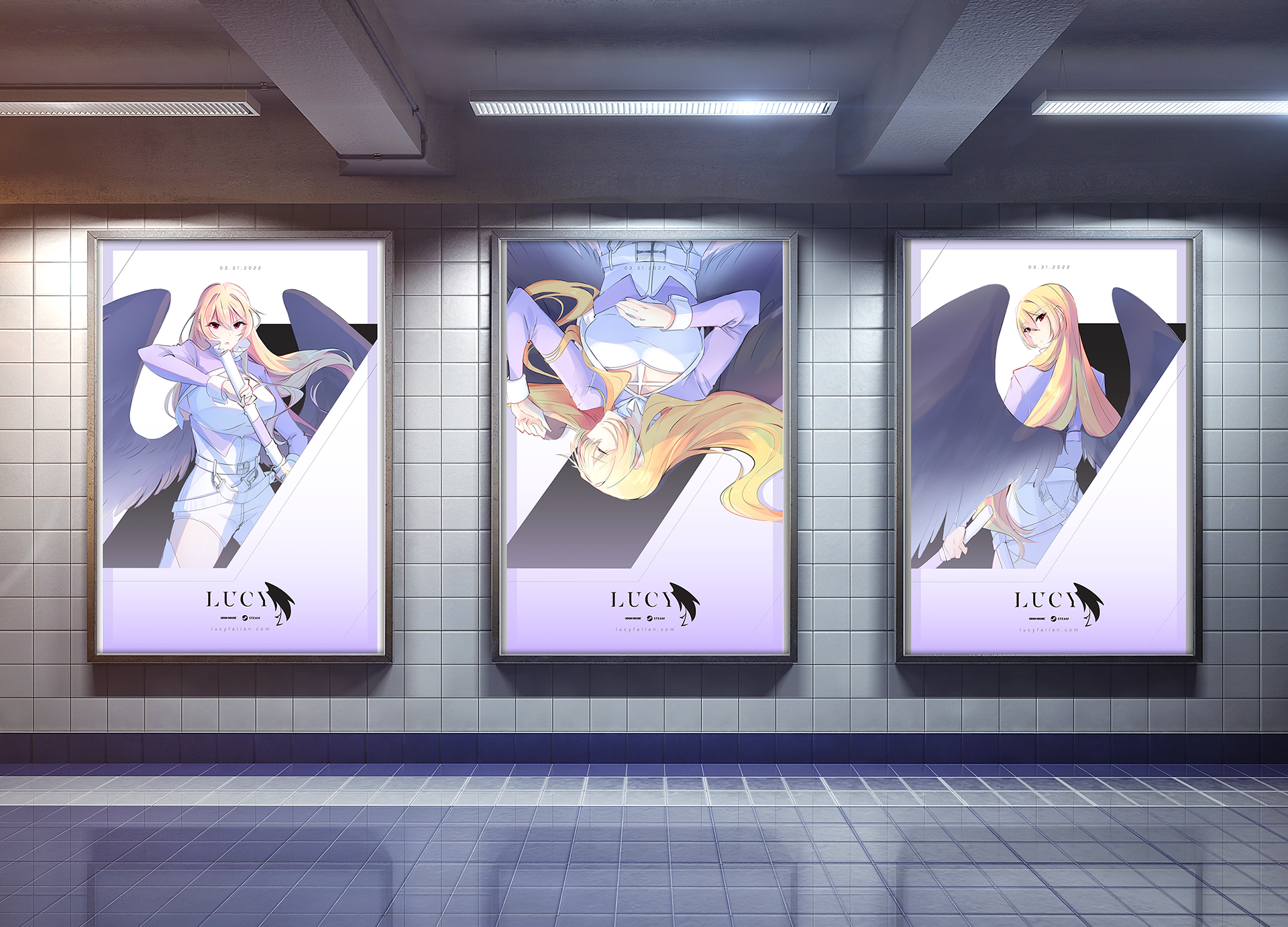
POSTERS
The posters are kept simple yet dynamic with elements borrowed from the website and game UI. The goal was to bring your focus to the illustration to catch your interest, and then to the details.
ILLUSTRATIONS
Original illustrations were drawn and used as assets for the website and posters. All illustrations are drawn by me.
TAKEAWAYS
The biggest challenge for this project was figuring out how to make things look simple yet full at the same time. I also managed to step out of my comfort zone and tried a different aesthetic. Tying together all the different mediums was fun yet challenging, and this was a great opportunity to allow myself to showcase another illustration style that I’m capable of doing.