CAMPAIGN // WEB // PRINT // ILLUSTRATION // CASE STUDY
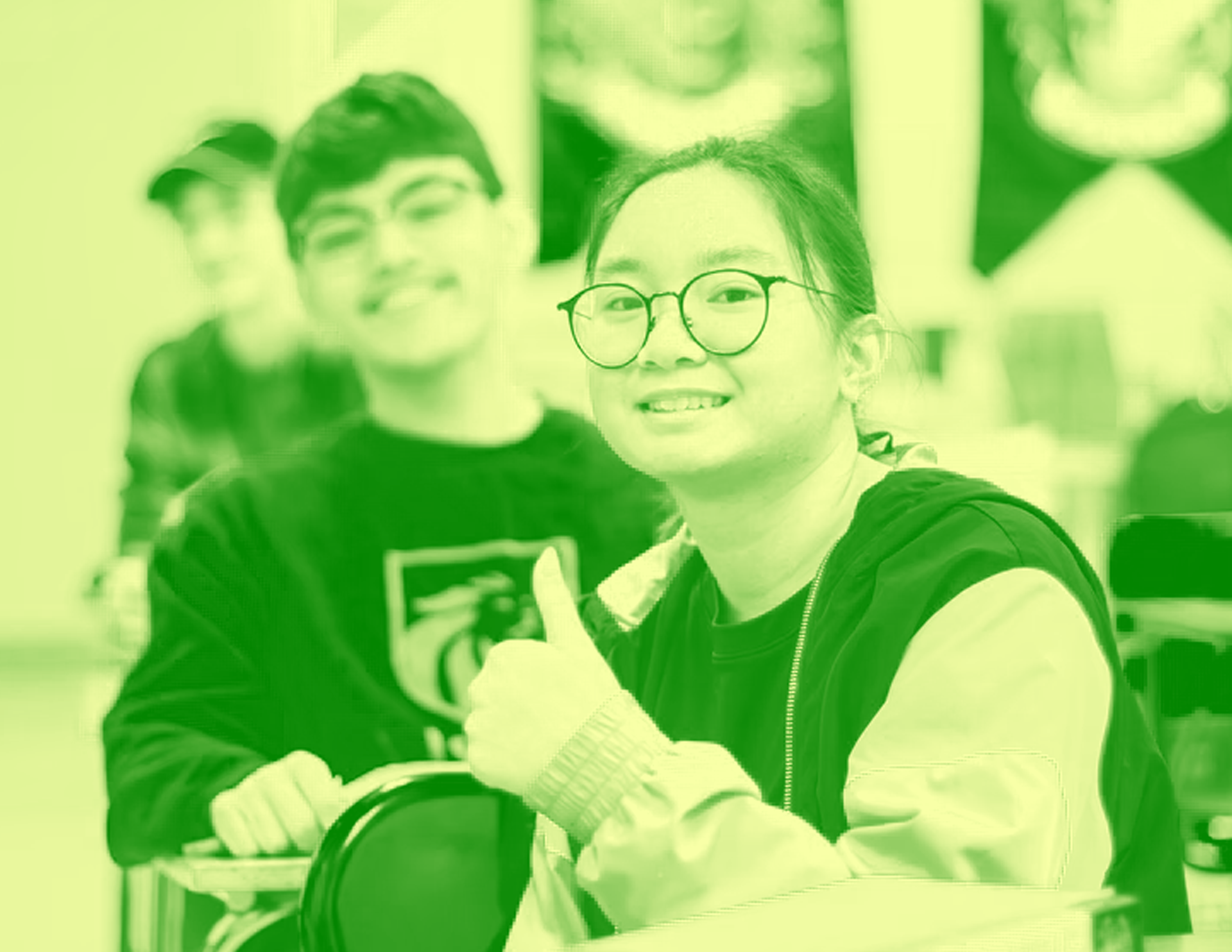
The Lemon-aid Truck is a traveling workshop that schools can book for their students, where they help introduce the topic and raise awareness of mental health to high school students in a more digestible and approachable way. Its bright and friendly visuals aim to provide an inviting tone and allow students to feel comfortable and more willing to learn about such a heavy topic.
OPPORTUNITY
Mental health is a heavy and unknown topic that might intimidate high school students from wanting to learn and understand more. There needs to be a more approachable way to help them be inclined to learn about mental health without feeling uncomfortable.

TARGET AUDIENCE
Although the target audience is mainly high school students, but I’ve also kept educators in mind. This is because educators, such as school executives/principals, will be the ones booking the workshop. The Lemon-aid Truck aims to be trustworthy so that educators can trust the service all the while captivating the interests of high school students.
CONCEPT
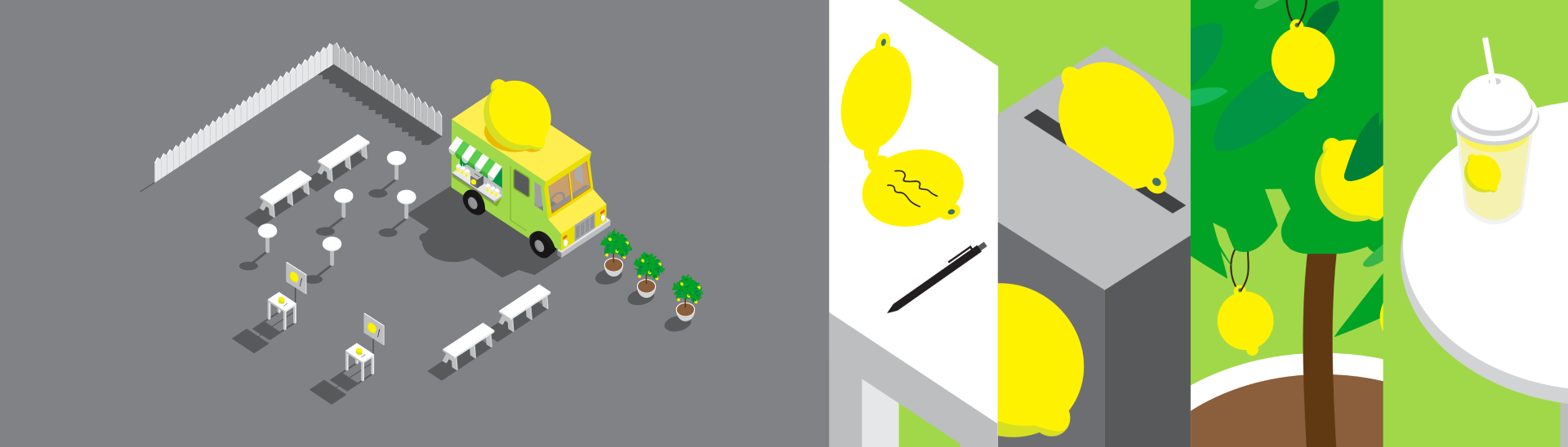
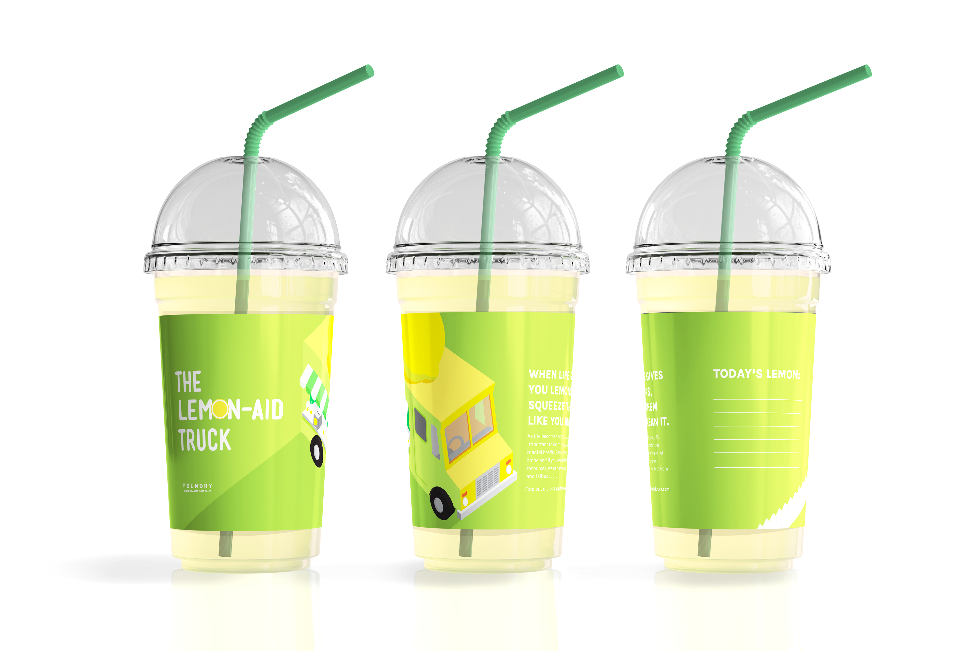
As mentioned earlier, it was substantial to include an interactive part to the workshop and concept. Students are given a note shaped liked a lemon and they can write their thoughts down. They will then bring it to the “box of lemons” and submit their note in or hang it by the nearby lemon trees provided, where we’ll “squeeze” them into a lemonade that they can enjoy during the presentation.
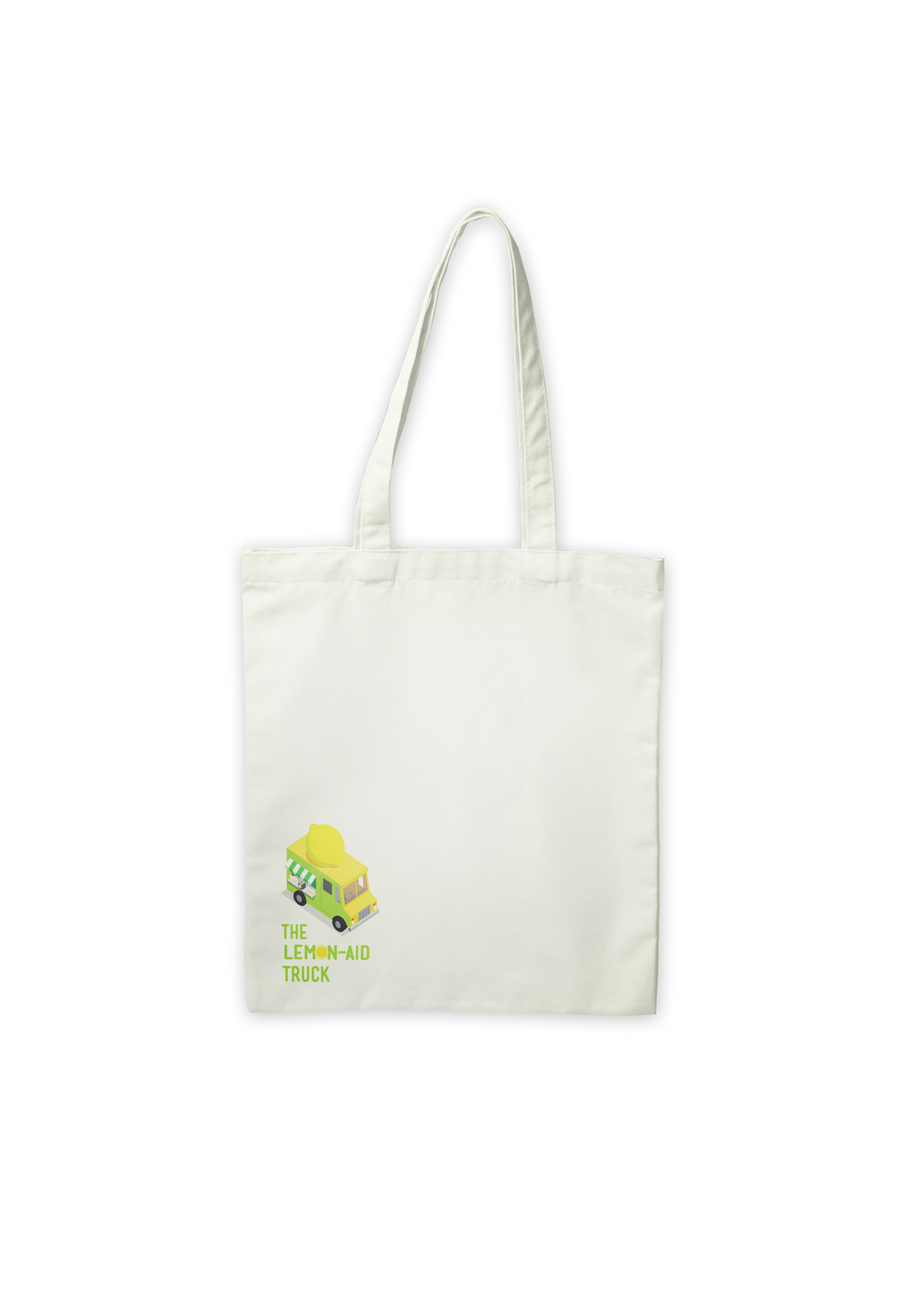
After the presentation, students are given a goodie bag to take home as well. The goodie bag serves to allow students to take a part of the workshop home and refer to helpful resources when needed.

STRATEGY
To combat the heavy topic, I’ve decided to go for more brighter atmosphere and friendly graphics as opposed to using a serious and solemn tone. This aims to captivate the target audience’s interest and keep them engaged during the presentation. The workshop wants the students to be willing to learn about the topic, not deter or bore them.
In order to build credibility for the workshop, The Lemon-aid Truck will ideally be partnering with an existing mental health organization such as Foundry BC. To appeal to the high school audience, I went for bold and bright visuals. I utilized the sense of familiarity such as lemonade to connect students to the topic. The usage of familiarity can help increase the chances of them recalling the workshop and the things they learned. Interactivity also plays a part in helping students recall the lessons learned, so The Lemon-aid Truck offers students an actual glass of lemonade for each student in order for them to both connect The Lemon-aid Truck to the next glass of lemonade they’ll drink, all the while providing something refreshing during the workshop instead of just sitting through it empty handed.
In order to build credibility for the workshop, The Lemon-aid Truck will ideally be partnering with an existing mental health organization such as Foundry BC. To appeal to the high school audience, I went for bold and bright visuals. I utilized the sense of familiarity such as lemonade to connect students to the topic. The usage of familiarity can help increase the chances of them recalling the workshop and the things they learned. Interactivity also plays a part in helping students recall the lessons learned, so The Lemon-aid Truck offers students an actual glass of lemonade for each student in order for them to both connect The Lemon-aid Truck to the next glass of lemonade they’ll drink, all the while providing something refreshing during the workshop instead of just sitting through it empty handed.
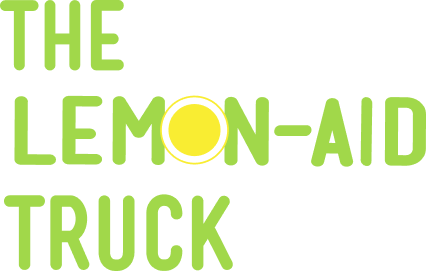
LOGO
For the logomark, I went with a simple and rounded font. I wanted to convey a sense of friendliness with the soft corners of the font while keeping it eye catching by having it all in uppercase. There is also a subtle nod to the lemon motif with a simple cross section of a lemon in replacement of the letter “O” for contrast and uniqueness.
COLOR & TYPEFACE
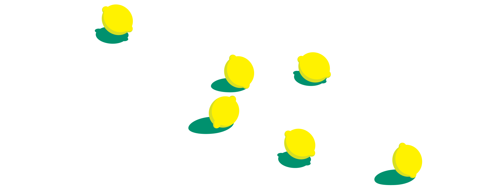
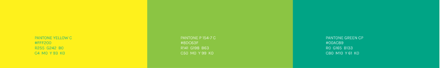
The colors chosen were colors reminiscent of a lemon, with a bright yellow paired with a slightly less saturated green. The iconic yellow and green can invoke an immediate relation to lemons, which is a recurring symbol in this brand. Aside from the yellow and green, I’ve also added an additional teal as a complimentary color as to not overuse the green and yellow. I chose teal because it’s a color that’s still within the range of the primary colors all the while can stand out against the two without being too similar.
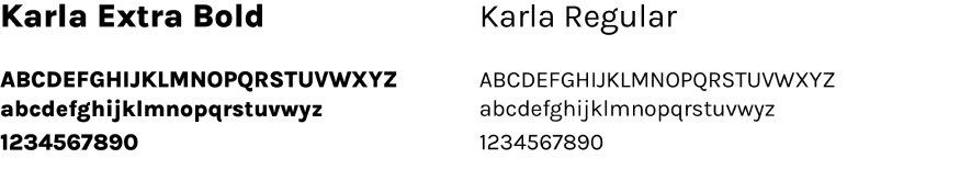
I chose Karla as the typeface as it’s friendly without using the same rounded corners as the typeface for the logomark.
I chose Karla as the typeface as it’s friendly without using the same rounded corners as the typeface for the logomark.
DESIGN SOLUTION
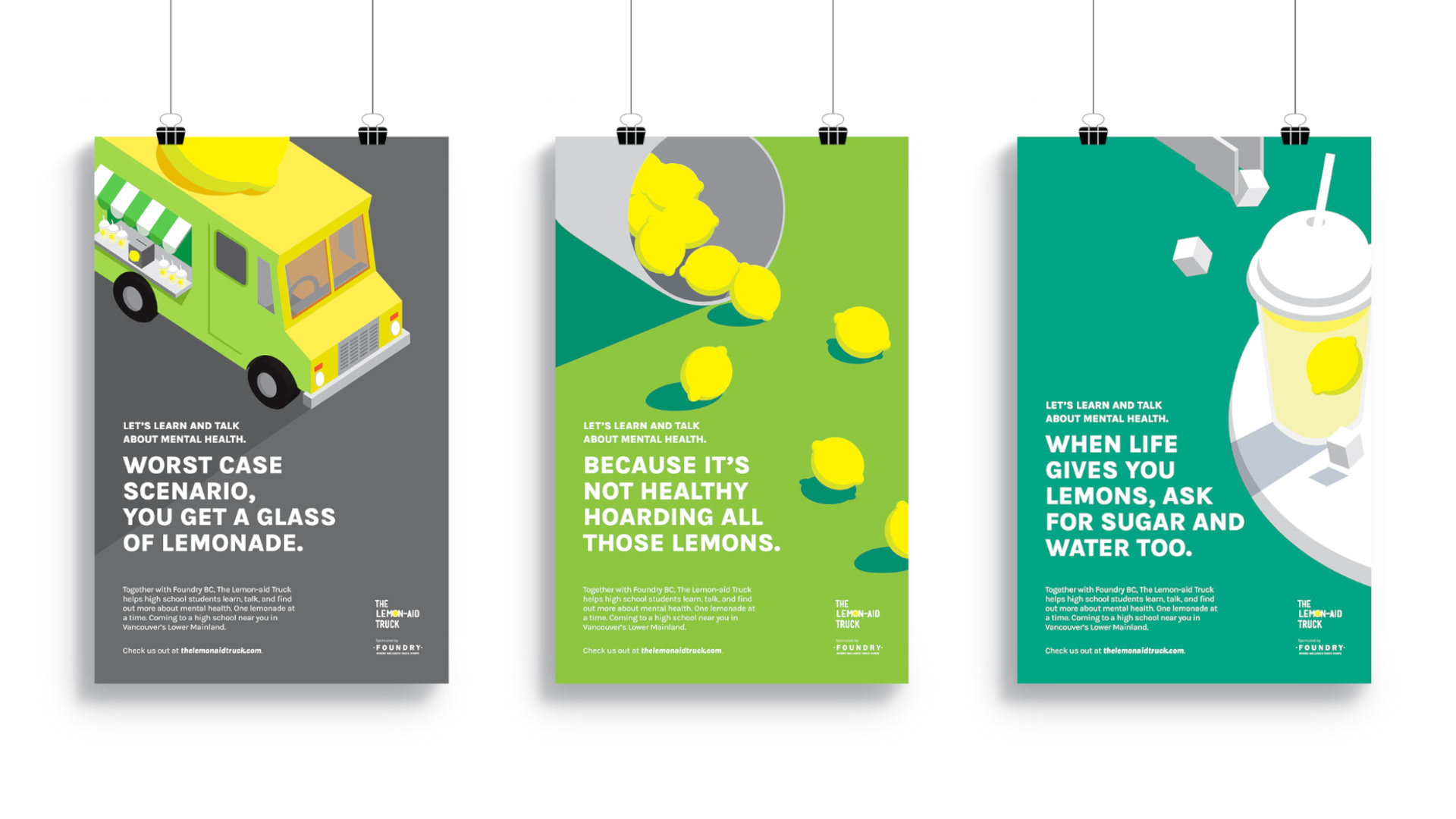
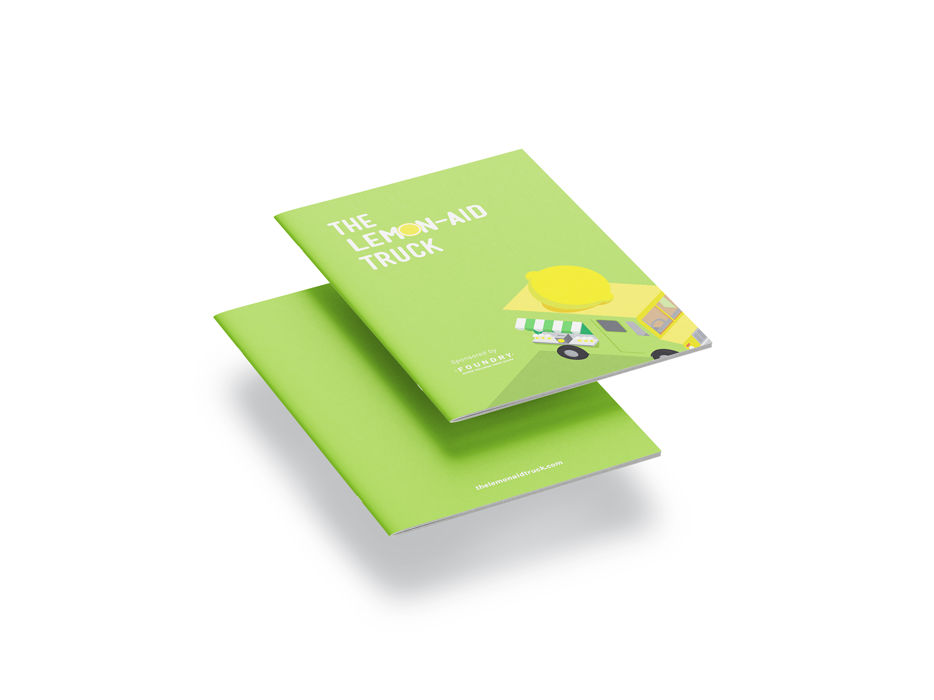
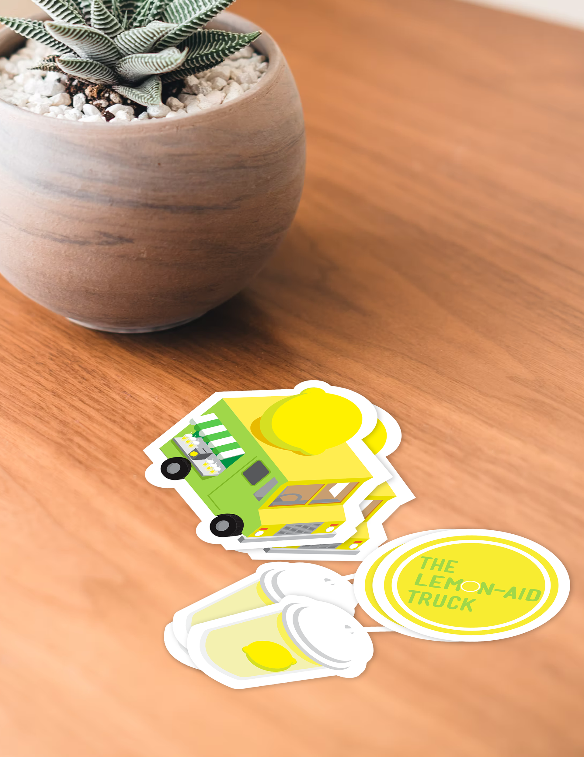
An isometric art style with bright colors was utilized to easily catch the attention of students. Campaign posters, websites, truck design, and goodies were created to generate buzz, recallability, and ability to access resources after the workshop.
It was important that the deliverables resonated with the younger generation and would be able to reach out to them in terms of exposure.


TAKEAWAYS
A big challenge in creating this project was the scope. I had too broad of an idea and did not focus enough on a specific target audience. After some feedback, I was able to end up with high school students as the main audience and properly develop the project around them with a clear goal. Another takeaway is that I’ve learned to simplify concepts and not over-convolute things, which can make things unclear and more complicated than it needs to be.